
NEWS
Gmail Settings Finally Get Material 3 Expressive Color Cards
Gmail’s Android settings are gaining Material 3 Expressive color cards after a year of inbox-only updates.

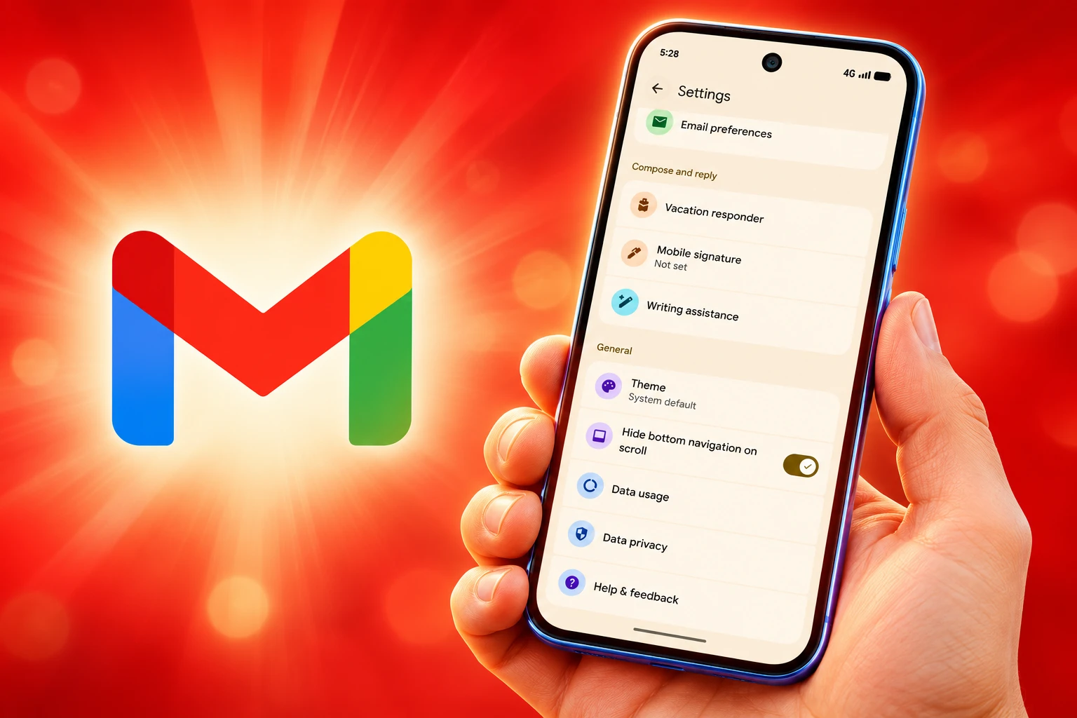
Gmail’s Android settings are gaining Material 3 Expressive color cards in version 2026.11.02.1020540846.Release. Screenshots from Telegram user Neacared, posted November 13, 2026, show rounded cards, new switches, and icons on each group. The paint is rolling out from Google’s servers, so the same build can still open the old list.
The inbox has looked Expressive since 2025. Settings did not. Google already rebuilt settings in the Google app, Gemini, and Messages this fall, and Gmail was the last dense menu in that set, now folding writing tools, Chat, and Meet onto labeled shelves.
Gmail’s Inbox Got This Look Last Year
Google unveiled Material 3 Expressive on May 13, 2025, at the Android Show ahead of I/O, promising springy motion, louder color, and bigger controls across Android and first-party apps. Gmail was an early tester in June 2025. The inbox and message view went wide on August 26, 2025, in version 2025.08.11.x, with the thread list sitting in one rounded container and swipe actions stretching into a pill.
Compose and the home-screen widget were still waiting then. Settings waited longer. The daily list of mail got the new shapes; the page where people hunt for notifications, Smart Reply, and Meet stayed a long unlabeled scroll. System-level Expressive landed on Pixel 6 and newer phones, plus the Pixel Tablet, with Android 16 QPR1 in September 2025. Gmail’s own inbox work had already shipped without that OS drop, which is why the leftover settings page stands out.
THE EXPRESSIVE CLOCK INSIDE GMAIL
- May 13, 2025: Google unveils Material 3 Expressive at the Android Show.
- June 2025: Gmail starts testing the look on the inbox and Chat tab.
- August 26, 2025: The inbox redesign rolls out widely in Gmail 2025.08.11.x.
- October 9, 2026: An APK teardown of Gmail 2026.10.05.993506826 turns on a regrouped settings page on a test phone.
- November 13, 2026: Neacared’s shots show the full color treatment in 2026.11.02.1020540846.Release.
Shiv, who posts as AssembleDebug, called the live page a colorful rounded card-based layout when those screenshots landed. That is the missing coat of paint on work that started in October, when testers could already see the new groups without Android 16’s full theme.
Three Other Apps Already Rebuilt Their Settings
Gmail is late to a settings kit Google has been assembling across its daily apps. A teardown of Google app 17.64.13 on October 6, 2026, showed card groups labeled Your App Experience and Privacy & Safety, with Search personalization, SafeSearch, and Results about you pulled onto the front of the page instead of sitting inside Privacy. Gemini followed on October 23, 2026, folding a split between the account menu and Gemini Settings into one screen after a server-side update on Android.
Gemini’s new page opens on Manage account and Usage limits, then a Preferences block that holds Notifications, Personal Intelligence, Avatar, Task settings, Theme, Skills, Voice, Media, Device controls, Cart and orders, and Gemini Notebook, with Data & privacy and Get support underneath. The account menu is now for switching accounts, feedback, and help. Messages was cited in the same settings pass, after its 2025 Expressive work had already put settings in rounded containers.
FOUR SETTINGS PAGES, ONE PATTERN
| App | When the new settings showed up | What got grouped |
|---|---|---|
| Google app | October 6, 2026 teardown, v17.64.13 | Your App Experience and Privacy & Safety cards; Search personalization, SafeSearch, and Results about you moved forward |
| Gemini | October 23, 2026 on Android | One settings page; Preferences, Data & privacy, Get support |
| Gmail | October 9, 2026 teardown, color on November 13 | Notifications, inbox customization, email preferences, writing assistance; Chat and Meet as their own sections |
The pattern is the same catalog: fewer raw rows, more labeled cards, and a handful of tools that used to hide in a dump now sitting on the first screen. Gmail had more rows to hide than the others, which is why its settings page became the holdout.
Writing Assistance Finally Has Its Own Shelf
The live Gmail shots replace the endless list with sections for notifications, inbox customization, email preferences, and writing assistance, and the same card language continues on the pages behind those rows. Smart Compose, Smart Reply, and Proofread now sit together under Writing assistance instead of turning up as scattered toggles. Chat and Meet get their own sections, which is the part of this pass that will bother anyone who still wants Gmail to behave like mail.
That split is the product decision under the color. Gmail has been a Workspace window for years, with chat, spaces, and calls sitting next to the inbox, and the settings page is where that claim becomes a map. Google has also been parking an AI inbox beside the chronological list for some Workspace users, so putting the writing tools on one shelf is the settings version of the same bet.
THE NEW SHELVES IN GMAIL SETTINGS
- Notifications: Email notification controls move behind their own category on the main page instead of living in the long scroll.
- Inbox customization: Layout and inbox options sit in a labeled group, then open into a card page of their own.
- Email preferences: The remaining mail toggles get the same container treatment as the rest of the page.
- Writing assistance: Smart Compose, Smart Reply, and Proofread share one section.
- Chat: Chat settings leave the mixed list and get a dedicated block.
- Meet: Meet follows Chat onto its own shelf, with larger tap areas and more space around the rows.
Larger touch targets and extra spacing run through those pages, which is how the updated Material 3 Expressive components are supposed to work: bigger controls, clearer groups, and color that points at the thing you came to change. The old Gmail settings page did the opposite. It rewarded memory. The new one rewards scanning.
Work and Personal Accounts Lose a Shortcut
The October teardown of Gmail 2026.10.05.993506826, enabled on a test phone, folded the old split between General settings and per-account settings into one categorized page. That cleanup has a cost for anyone running work and personal mail on the same phone. Changing another account’s settings now means leaving the page, switching accounts in Gmail’s usual switcher, and coming back.
The prior path let you open Settings, tap General for app-wide controls, or tap an account for that inbox. Related options lived on separate screens, which was messy, and it was also a direct jump. The new flow keeps the main page cleaner and adds a hop for the people who use settings the most, because they are the ones with two inboxes and a reason to be in that menu.
Chat and Meet sitting as peers to mail will read the same way. If you treat Gmail as a messaging hub, those shelves are overdue. If you treat it as mail, they are Workspace furniture in a room you did not ask to redecorate. The color does not settle that fight. It just makes the furniture easier to see.
Lab Tests Closed the Age Gap on Taps
Google’s Material team spent three years on this look. Researchers ran 46 studies with more than 18,000 people, using eye tracking, surveys, and timed tasks, and they treated color, size, shape, and containment as findability tools, not decoration. In a lab with eye-tracking glasses, people used 10 apps in Expressive and older Material 3 versions, in random order, and they could spot key controls up to four times faster on the Expressive screens.
Participants were able to spot key UI elements up to four times faster in the M3 Expressive designs, suggesting that they steer user attention toward the most important part of the screen.
Material researchers, Google Design
An email mock in that work put a larger Send button above the keyboard in a secondary color, against a small Send control parked in the top bar next to attach. Asked to send the mail, people’s eyes found the new button four times faster. Tests that usually show older adults taking longer to locate controls saw that gap close: users 45 and older matched younger testers on fixation time. Preference was strongest among 18-to-24-year-olds, at up to 87 percent, and the team also found that breaking a familiar pattern, like unlabeled email actions, hurt usability even when the screen looked modern.
WHAT THE LAB MEASURED
- The sample: 46 studies with more than 18,000 people, plus timed use of 10 apps.
- The find-time: Key controls spotted up to four times faster, including Send in an email layout.
- The age split: Testers 45 and older matched younger users on how fast they locked onto controls.
- The taste gap: Up to 87 percent of 18-to-24-year-olds preferred the Expressive screens.
Gmail settings are a findability page. People open them to hunt a toggle, not to enjoy a theme, which is why Google’s own numbers sit under this rollout even though the company has not billed the Gmail pass as a research demo. The cards and icons are doing the job those studies described: grouping like with like, and making the row you want larger and louder.
The Latest Gmail Build Still Shows the Old List
The colorful page is on a server flag. Installing 2026.11.02.1020540846.Release is not enough, and two phones on that build can still disagree. Testers who forced the October groups on Android 15 got the new information architecture without Android 16’s full Expressive styling, so the color you see also depends on what the OS will paint. How wide Google has opened the flag, and in which regions, is still unstated.
WHAT WE KNOW
- The build: Screenshots are from Gmail 2026.11.02.1020540846.Release, a 207.54 MB package for com.google.android.gm.
- The flag: The new settings page is gated server-side, on top of the Play Store binary.
- The Play blurb: Gmail’s current Android listing was updated November 12, 2026, still talking about Workspace in one window, not about settings.
WHAT IS UNCONFIRMED
- The width: Google has not said what share of Android users can see the cards.
- The OS cut: Full Expressive color may need Android 16, after the Android 15 test showed groups without the theme.
- The hop: The extra account-switcher step from the October teardown has not been confirmed in every live screenshot.
Gmail’s Play Store page still lists 10B+ installs and a generic Workspace what’s-new note. Until Google flips the flag on an account, that listing and the old settings scroll can sit on the same phone, which is the quiet part of a redesign that spent a year waiting behind an inbox that already looked new.

One UI 9.5 Beta Puts the Galaxy S26 on Last Year’s Clock

DBS Puts a 24/7 USDC Window Inside the Bank

European Startups Head for $81 Billion as First Checks Shrink

US Stocks Lost $1.3 Trillion Before Nvidia’s Beat

Home Depot Bets on Finance Chief Richard McPhail as CEO

Aramco Crash Kills 14 Two Days After Oil Restart

Salah Captained Egypt to Their First World Cup Win

Zelda’s 40th Switch 2 Ships Without a Zelda Game

Apple Labor Day Deals Hide June’s Memory Price Hike

El Niño Puts Israel’s Needed Winter Rain on a Flood Clock
-
 BUSINESS5 months ago
Aramco Crash Kills 14 Two Days After Oil Restart
-
 NEWS6 months ago
Salah Captained Egypt to Their First World Cup Win
-
 GAMING2 months ago
Zelda’s 40th Switch 2 Ships Without a Zelda Game
-
 NEWS3 months ago
Apple Labor Day Deals Hide June’s Memory Price Hike
-
 NEWS4 months ago
El Niño Puts Israel’s Needed Winter Rain on a Flood Clock
-
 GAMING2 months ago
Palworld 1.0.4 Adds Palpedia Search After the 1.0 Launch
-

 NEWS4 months ago
Saudi Visa Routes Split Nigerian Travelers Into Two Speeds
-

 BUSINESS9 months ago
BAE’s 60-Year Saudi Franchise Now Runs Through Taif