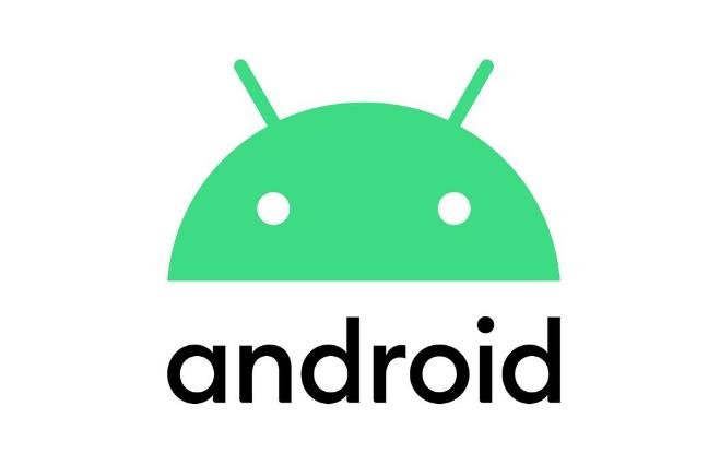
Google has unveiled a new logo for its Android operating system, which is said to be inspired by Material design and the Google brand palette. The new logo features a simplified and dynamic robot icon, along with a sleeker and more modern typeface. However, not everyone is impressed by the redesign, as some critics have pointed out that it looks too similar to other logos in the market.
A modern new look for Android
According to Google, the new logo is meant to reflect the evolution of Android as a platform that connects people, community and cultural moments. The robot icon, which has been part of Android’s identity since 2008, has been updated to be more expressive and adaptable. The icon can also change its color and shape depending on the context and user preference.

The new typeface, on the other hand, is a custom version of the Google Sans font, which is also used by other Google products such as Gmail, Maps and Photos. The font is designed to be more readable and accessible, especially on smaller screens. The new logo also uses a green color that is more vibrant and eye-catching than the previous one.
Google says that the new logo will start rolling out in the coming weeks, along with the launch of Android 12, the latest version of the operating system. The company also encourages developers and partners to adopt the new logo and branding guidelines for their apps and devices.
A bland and generic logo for Android
However, not everyone is happy with the new logo, as some critics have argued that it lacks originality and personality. Rob Beschizza, a writer for Boing Boing, a popular blog that covers technology and culture, wrote that the new logo is “another brand falling into conformance with the ultrahomogenous sans-serif logotype situation that’s been going on the last few years.” He also noted that the previous logos had more character and distinctiveness.
Some users on social media also expressed their disappointment and dissatisfaction with the new logo, saying that it looks too similar to other logos such as Apple’s iOS, Huawei’s HarmonyOS, Microsoft’s Windows and Samsung’s One UI. Some also said that the new logo does not represent the diversity and openness of Android as a platform that supports different devices and manufacturers.
Some users also pointed out that the new logo does not match well with the name Android, which implies a robotic and futuristic theme. They suggested that Google should have kept the old robot icon or come up with a more creative and unique design.
A matter of taste and preference for Android
Ultimately, the new logo is a matter of taste and preference for Android users and fans. Some may like it for its simplicity and elegance, while others may dislike it for its blandness and genericness. Some may not care at all, as long as the operating system works well and offers them the features and functions they need.
What do you think of the new logo? Do you love it or hate it? Let us know in the comments below.
