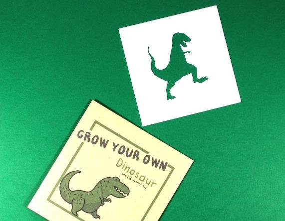
Koto, a London-based creative studio, has designed a playful and eye-catching identity for Dino, a new eco-friendly brand that aims to make sustainability more accessible and fun. The identity features a series of colourful and quirky dinosaur illustrations, as well as a bold and dynamic logo that reflects the brand’s mission and personality.
Dino: a brand that wants to make a difference
Dino is a brand that was founded by two friends who wanted to create products that are good for the planet and the people. They believe that sustainability should not be boring or complicated, but rather enjoyable and easy. Their products include reusable water bottles, coffee cups, bags, and straws, all made from recycled or biodegradable materials. They also donate 10% of their profits to environmental charities and initiatives.

Dino’s founders approached Koto to help them create a brand identity that would stand out from the crowd and appeal to a wide range of customers. They wanted an identity that would communicate their values of being eco-friendly, ethical, and fun, as well as their passion for dinosaurs.
Koto’s creative process and solution
Koto’s creative team started by researching the history and evolution of dinosaurs, as well as their cultural and pop culture references. They were inspired by the diversity and adaptability of these ancient creatures, as well as their connection to nature and the environment. They decided to use dinosaurs as the main visual element of the identity, as they felt they would resonate with both children and adults, and convey a sense of curiosity and adventure.
Koto then developed a series of dinosaur illustrations, each with its own name, personality, and backstory. The illustrations are simple and stylised, using geometric shapes and bright colours. They are also animated to add more life and movement to the identity. The illustrations are paired with a custom-made wordmark that spells out Dino in uppercase letters. The wordmark is designed to be flexible and adaptable, changing its shape and orientation depending on the context. The wordmark also incorporates elements of the dinosaur illustrations, such as scales, spikes, or teeth.
The identity also includes a tagline that reads “Making sustainability fun”, as well as a colour palette that consists of vibrant hues such as pink, yellow, green, and blue. The identity is applied across various touchpoints, such as packaging, website, social media, merchandise, and signage.
Koto’s impact and feedback
Koto’s identity for Dino has been well received by both the client and the public. The identity has helped Dino to launch its products successfully and attract attention from customers and media outlets. The identity has also been praised for its originality, creativity, and humour, as well as its ability to communicate Dino’s message of making sustainability fun.
Koto’s co-founder James Greenfield said: “We loved working with Dino on this project. They are a brand that shares our values of being positive, playful, and purposeful. We wanted to create an identity that would reflect their vision and personality, as well as make people smile. We think dinosaurs are a great way to do that.”
Dino’s co-founder Tom Smith said: “We are thrilled with the identity that Koto created for us. They really understood our brief and delivered an amazing result. The identity captures our essence perfectly and makes us stand out from the competition. We love how they brought our dinosaurs to life and gave them each a unique story. We can’t wait to see how our customers react to them.”
